Last updated: 12 November 2026
Quick Summary
Interior design in 2027 favours judgement over the fleeting gesture: every piece should have a reason to be where it is. The trends are defined by natural palettes with measured accents, organic shapes, sustainable materials and warm, dimmable, layered lighting.
- The palette is built on warm neutrals, with greens, earth tones and clay as the foundation.
- Mist blue and burgundy are the most common accents in neutral living rooms.
- Work with three layers of lighting: general, task and ambient.
- For the living room, dining room and bedroom, use warm light at 2700 K to 3000 K.
- Choose one base style and use the others as accents, never in equal parts.
Table of Contents
- Interior design trends 2027: what changes and what stays
- Decor colour trends 2027: natural palettes and measured contrasts
- Organic shapes and soft volumes: comfort as a design principle
- Sustainable materials in interior design: tactile textures and mixed surfaces
- Luxury decorative lighting: pieces that change the atmosphere
- Styles that define 2027: Japandi, maximalism and eclectic vintage
- How to apply each trend according to budget and type of home
- Specific combinations by room: living room, dining room and bedroom
- How to tell a lasting trend from a passing fad
- Refresh your living room with the Zach & Decor selection
- Frequently Asked Questions
Interior design trends 2027: what changes and what stays
The short answer: in 2027, interior design moves away from the fleeting gesture and puts its faith in judgement.
What changes is the intensity. What stays is the foundation: calm, honest materials and spaces that age well.
One fact is worth bearing in mind before we go on. According to the annual report of the European furniture industry association, demand for furniture made from natural materials and produced locally has grown steadily in recent years.
Decor colour trends 2027: natural palettes and measured contrasts
The short answer: the 2027 colour palette is built on warm neutral bases and finished with measured accents, not garish ones. Colour stops being the absolute star and becomes the accent that gives the room its order.
Greens, earth tones and clay: the colour foundation of the year
Olive green, moss green, forest green. Terracotta, clay, warm brown. Natural tones are the backbone of the palette because they sit well together and with almost any architecture.
A common mistake is to treat them as wall colour when they work better as a layer: an olive green upholstered piece against beige walls, or a rug in earth tones on a light floor, achieves more with less and keeps the room bright.
Mist blue, burgundy and accents that lift a neutral living room
Mist blue and burgundy are the two accents turning up most often in neutral living rooms. The first brings an almost atmospheric visual softness; the second introduces a bold colour contrast without being loud.
The key is proportion: a burgundy sofa in a beige living room works; a burgundy wall does too, but only if the rest of the room can breathe. To see specific accents on a neutral base, we have a guide to colours that go with beige at home.
And if what you need is a method for spreading colours without getting it wrong, the 60-30-10 rule applied to decor explains how to distribute base, materials and accents within one room.
Organic shapes and soft volumes: comfort as a design principle
Organic shapes and soft volumes stop being an aesthetic device and become a design principle.
Curves appear in coffee tables with irregular outlines, sofas with rounded arms and lamps with sculptural silhouettes.
An oval coffee table has no corners in the walkway, and in a living room with children or little space to move around, that is worth more than any aesthetic argument.
Sustainable materials in interior design: tactile textures and mixed surfaces
The short answer: sustainable materials in interior design are chosen for how they behave over time, not for a label.
Natural stone, responsibly sourced woods, wool, jute, linen, rough-finish resins.
The mix of materials carries decisive weight in the outcome of a project. Marble on wood. Travertine next to wool. Rough resin beneath braided jute.
Durability, upkeep and life cycle of each material
- Marble and travertine: natural materials, each piece with its own veining. They stand up well to use, but they are porous and should be sealed. A travertine coffee table ages with dignity if looked after.
- Solid wood: lasts for decades. It can be sanded and restored. It is the most honest option in the long run.
- Wool: it has weight, it keeps you warm and it ages well. A wool rug for daily use keeps its body for years.
The practical rule: choose the material for the use it will get, not for the photo. A marble table in a hallway you simply pass through is not the same as one in a dining room used every day.
Luxury decorative lighting: pieces that change the atmosphere
The short answer: in 2027, luxury decorative lighting is measured by how it spreads light and how it fits into the room, not by price or apparent brightness. A lamp can bring order to an entire living room or ruin it, and the difference almost never lies in the cost, but in the colour temperature, the installation height and the mix of layers.
The three layers every room needs
A frequent mistake is to rely on a single source for all the lighting. The usual practice is to work with three layers: general light (ceiling), task light (bedside, worktop, reading) and ambient light (walls, corners, floor).
- General light: a ceiling or pendant piece that bathes the room without dazzling. With high ceilings, a pendant with a diffusing shade works; with low ceilings, a ceiling solution that does not intrude on the walkway is better.
- Task light: a desk lamp or wall light next to the sofa, the bed or the worktop, adjustable and dimmable.
- Ambient light: hidden LED strips, wall lights at mid-height or floor lamps with indirect light. These are the ones that create the atmosphere as evening falls.
Colour temperature and dimming: the detail almost nobody checks
Colour temperature is measured in kelvin (K). For a home, the usual range is:
- 2700 K to 3000 K: warm light, the most suitable for the living room, bedroom and dining room. It encourages relaxation and does not alter how natural materials look.
- 3500 K to 4000 K: neutral light, useful in the kitchen and bathroom for tasks that call for precision.
- Above 5000 K: cool light, kept for work areas or garages; in a room for resting, it feels uncomfortable.
It is also advisable for the main light fittings to be dimmable: lowering the intensity at night completely changes how a room feels.
Heights and distances that work
- Pendant over a dining table: between 70 cm and 80 cm above the table surface. If it is a group of several pieces, stagger them between 60 cm and 90 cm to create visual rhythm.
- Pendant over a side table or corner: at 1.60 m to 1.70 m from the floor, so that it sits above the eyeline of a seated person.
- Wall lights: at 1.50 m to 1.70 m from the floor in hallways and at 1.10 m to 1.20 m beside the bed, for reading without glare.
How to choose the decorative piece
What sets a good piece apart is how it treats light and material: a rough resin shade casts a different light from a polished glass one, and a braided jute finish adds warmth to the ceiling's shadow. In our selection, the Lámpara de colgar Duna is a clear example: organic volume, rough cream resin and a jute finish, 42 cm wide and 53 cm tall.
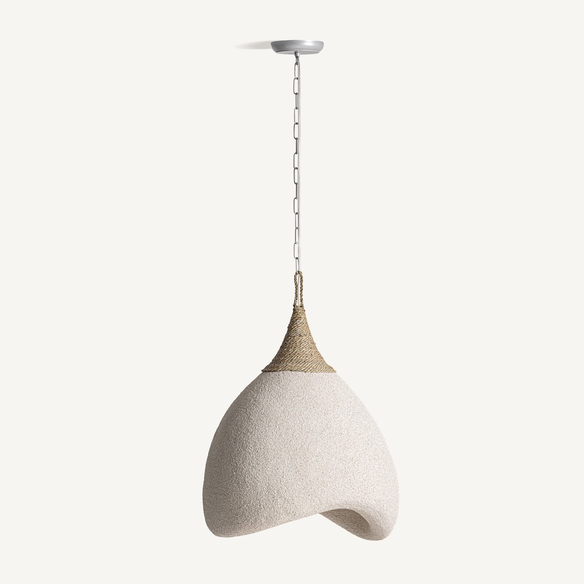
Lámpara de colgar Duna
Watch out: a pendant lamp hung too low over the dining table can be uncomfortable when you sit down. Before buying, measure the clear height from the table and check that it sits above the eyeline of the diners.
Lighting and wellbeing: what can be measured
Lighting affects rest and the sense of spaciousness. Three guidelines: avoid cool light sources in the bedroom; place ambient light on walls and ceilings so that it bounces and softens the shadows; and in small rooms, replace one powerful source with two or three softer points.
Styles that define 2027: Japandi, maximalism and eclectic vintage
The short answer: the three styles coexist this year because they answer different temperaments, and the key is not to pick one and apply it from start to finish, but to decide which will be the base style and how much space to leave for the others. The results that work best in 2027 are the ones that mix with proportion, not the ones that copy a catalogue.
Japandi: calm with discernment
Japandi remains the choice for anyone seeking calm: clean lines, natural materials, a restrained palette and nothing superfluous. Its strength is restraint, and also its risk: poorly executed, it turns cold and bland.
Three guidelines to make it work:
- Colour base: two or three tones at most (off-white, linen, stone grey) and a single earthy or muted green accent.
- Materials: medium or light wood, linen, paper, matt ceramic. Avoid mixing more than three dominant materials.
- Texture: with no colour, texture does the work. A chunky wool throw, a jute rug or a linen curtain add warmth without breaking the palette.
It is the easiest style to maintain and the hardest to tire of, but it demands discipline: every object must have a function or a clear sentimental value.
Orderly maximalism: how to avoid chaos
Maximalism is back with force, but in a more orderly version: delicate prints, a mix of eras and pieces with character, always with a base to hold it all up. The difference between maximalism and clutter lies in repetition and negative space.
- Repeat a motif: if you use a floral print, let it appear on two or three pieces (cushion, curtain, tableware) and not on all of them.
- Leave some air: a wall full of pictures works if the rest of the room can breathe. If the living room already has plenty going on, choose a single feature wall.
- Limit the palette: maximalism is not using every colour, but many shades of the same family. Three or four base colours with their variations avoid visual overload.
Maximalism demands more judgement than it seems. It is the style most regretted by those who copy it from a photo without adapting it to the light and size of their room.
Eclectic vintage: working inherited pieces in
Eclectic vintage is establishing itself as the middle path for anyone who inherits furniture and wants to integrate it without the home looking like an attic. The key is the dialogue between eras: an old piece gains when it sits alongside a contemporary one that contrasts with it.
- Contrast rule: for every inherited piece of furniture, introduce one piece with a current line (a lamp, a side table, a picture). The contrast makes the old read as intention and not as accumulation.
- Unify with colour: paint the walls a warm neutral and repeat that tone in the textiles. That way pieces from different eras share a common thread.
- Limit the quantity: three or four vintage pieces per room is enough. Beyond that, the eye gets no rest.
Eclectic vintage is the one that ages best, because it was never entirely in fashion. But it demands a decision first: what stays and what goes; without that pruning, it becomes a storeroom.
How to combine them without competition
The formula that works best is to choose one base style and use the others as accents:
- Japandi base + one maximalist accent: a serene room with a single boldly patterned piece or one intensely coloured picture.
- Eclectic vintage base + Japandi restraint: inherited furniture against neutral walls and plain textiles, with warm, dimmable lighting.
- Maximalist base + vintage order: plenty of pieces, but from coherent eras and materials, with a limited palette.
Watch out: mixing all three styles in equal parts tends to produce a room with no visual hierarchy. Before buying, decide which style is dominant and what share of the room belongs to it; the rest should stay in the background.
How to apply each trend according to budget and type of home
The short answer: apply it in layers and in order of impact. First the base colour, then the material, then the shape, and finally the statement piece. Reversing that order is the most common cause of a refurbishment that does not work.
Budget |
What to change first |
Impact |
Where you notice it |
|---|---|---|---|
Tight |
Textiles and rug |
High |
Warmth and sound absorption |
Medium |
Lighting and coffee table |
Very high |
Atmosphere and flow |
Generous |
Upholstery and sculptural piece |
Maximum |
Character of the room |
Very generous |
Foundation materials |
Definitive |
Floor, walls and stone |
Small flats, rentals and awkward layouts
In a small home, three rules: a light, warm base, a single focal point with colour, and nothing that interrupts the walkway. Organic shapes help more than you might think: an oval outline frees up circulation.
In a rental, do not touch anything structural: work with a rug, floor or pendant lighting, textiles and occasional furniture. If your living room is compact, we have a guide on how to decorate a small living room so it looks bigger.
Specific combinations by room: living room, dining room and bedroom
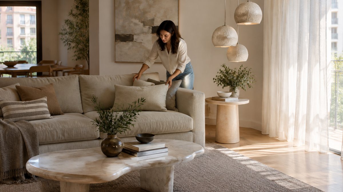
Infographic with decor schemes for a living room, dining room and bedroom with organic textures and neutral tones.
In the living room, the combination that works best this year is a sand-coloured sofa, a natural stone coffee table and a taupe wool rug. On that base, just one accent: olive green or burgundy.
In the dining room, the bet is on the grouped lamp: three or four pieces of organic volume at different heights over the table, and the rest kept quiet. A light wooden table and chairs with soft lines complete the scene without competing.
In the bedroom, the trend calls for texture and restraint: linen, wool, earth tones and warm, low lighting. Nothing shiny.
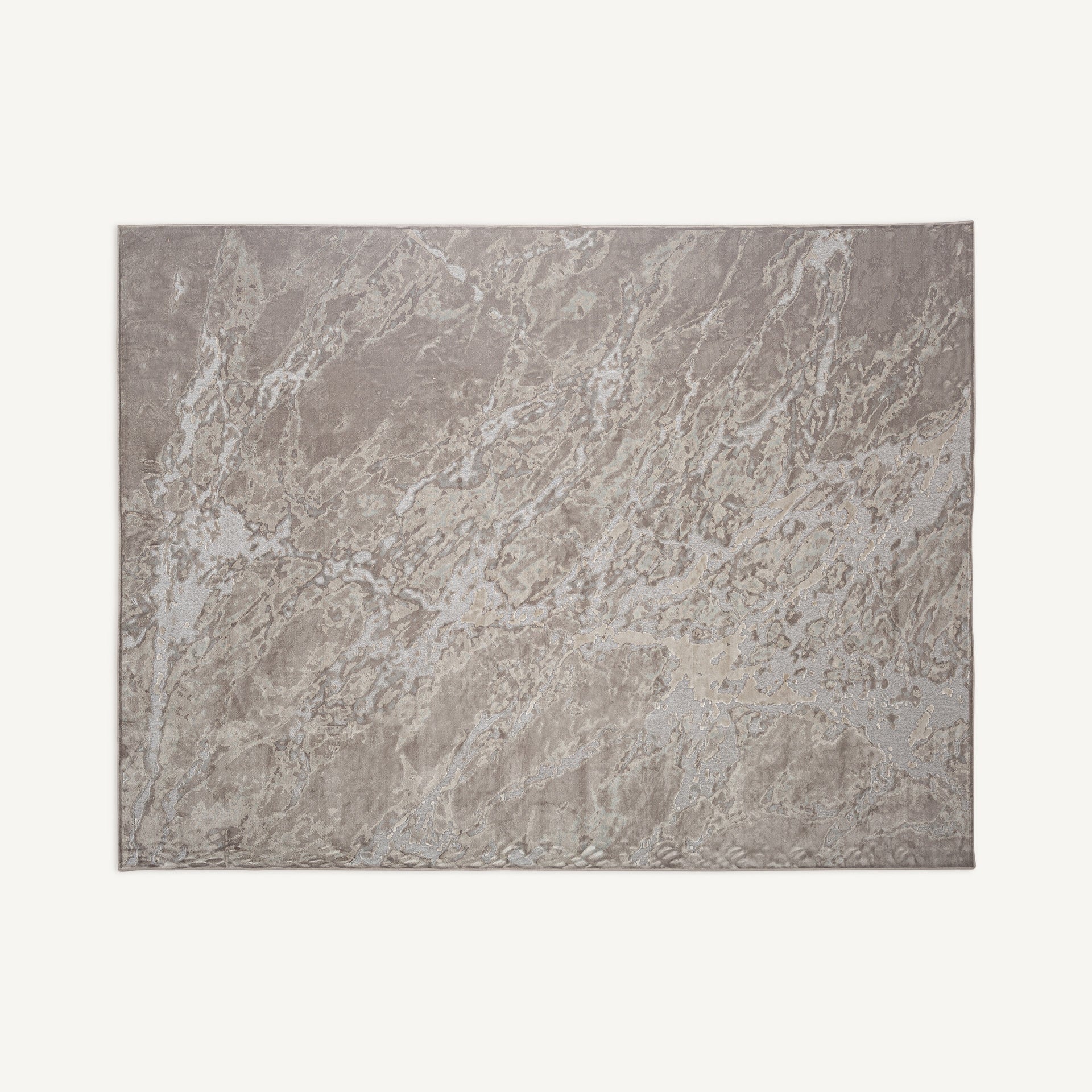
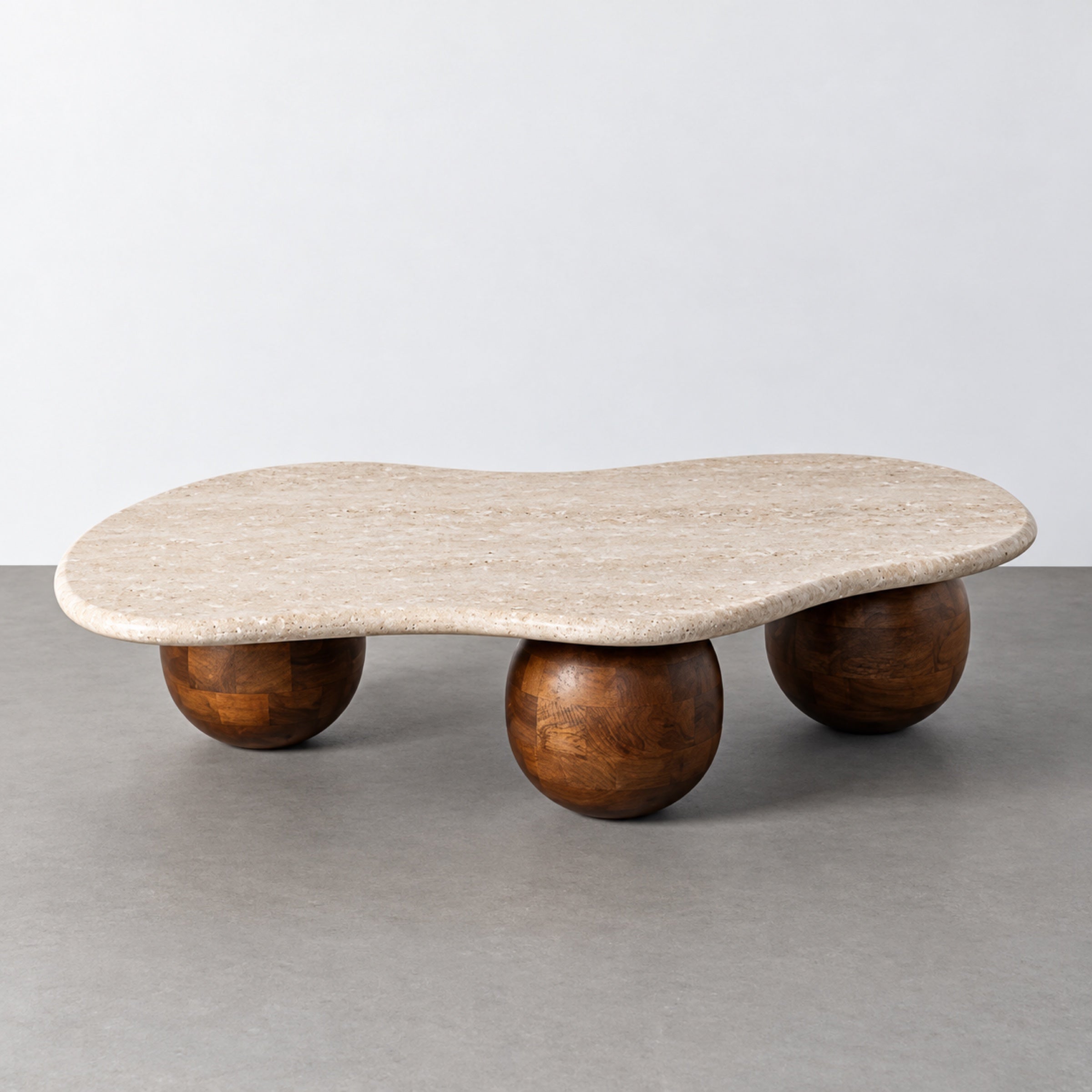
For the living room, two specific pieces from our selection fit this idea. The Alfombra Galea, with organic shapes inspired by the earth and a viscose finish that reflects the light, brings that quiet warmth. And the Mesa de centro Veta, with a marble top of organic outline on mango wood spheres and 27 cm high, invites a relaxed living room.
How to tell a lasting trend from a passing fad
The short answer: a lasting trend solves a problem; a passing fad solves a photo. That is the filter.
If all three answers are yes, you are looking at a timeless piece; if any is a no, at a fad. Neither is a mistake, but it helps to know which one you are buying and how much you are paying for it.
We have a guide dedicated to timeless decor and the pieces that never expire if you would like to explore this principle further.
Refresh your living room with the Zach & Decor selection
The challenge for 2027 is not choosing a trend, it is choosing it well and making it last. Interior design in 2027 rewards judgement over novelty, and that demands pieces that are up to the task.
At Zach & Decor we work with a selection of furniture, lighting, textiles and rugs in limited editions, designed to create atmospheres of calm, beauty and wellbeing. Our interior design studio helps you combine them: the Mesa de centro Verona, with a travertine top and a fluted light wood base, or the Alfombra Lena, in taupe wool with carved relief, are two good starting points.
You can explore the full selection of decor and find the pieces that suit your space.
Interior design in 2027 does not ask for more things, it asks for better ones.
Frequently Asked Questions
What are the dominant colours in interior design for 2027?
The dominant palette revolves around natural greens such as olive, moss and forest, combined with earth tones, clays and terracotta. Mist blue and burgundy appear as accents in individual pieces: a rug, an upholstered piece or a vase. The key is to build a warm neutral base and add just one colour contrast per room, without overloading the space.
How do I bring sustainable materials into my interiors without raising the budget?
Start with the pieces that cover the most surface: a natural wool rug such as the Alfombra Lena, at 300 × 200 cm for €490, stands up to daily use and ages well. Mango wood or travertine in a coffee table add texture and last for decades. Prioritise fewer, better-quality pieces over renewing everything every season.
Which materials will be trending in furniture in 2027?
Travertine marble, light-toned woods with matt finishes, wool, jute and rough-textured resins. The mix of materials is what defines the year: the Mesa de centro Veta combines an organic marble top with mango wood spheres, and the Lámpara Duna brings together cream resin with a braided jute finish. The result is material-rich surfaces you can feel to the touch.
How do I create an atmosphere of calm and wellbeing at home following the new trends?
Work with three layers: a neutral, warm colour base, cornerless shapes that make it easy to move around, and filtered light at different heights. Soft curves reduce the feeling of rigidity and visual clutter. Add tactile textures, such as a viscose rug that reflects the light, and avoid accumulating objects. Calm is built with free space, not with more pieces.
Which decorative styles will define interior design in 2027?
Japandi remains strong thanks to its blend of Japanese serenity and Scandinavian functionality. Measured maximalism is gaining ground, with delicate prints and layered colour, along with eclectic vintage, which combines pieces from different eras. Quiet luxury remains the common thread: noble materials, restrained palettes and sculptural furniture without garishness.
How do I choose luxury decorative lighting that will not go out of fashion?
Look for pieces where volume and material come before the trend: resin, jute, ceramic or matt metal age better than glossy seasonal finishes. A Lámpara de colgar Duna, 42 cm wide and 53 cm tall, works alone in a corner or in a group of three at different heights over the dining table. Grouping several creates presence without depending on fashionable design.